

Proyecto
Sip-it
Cliente
Sip-it
Año
2024
Sip- it is a specialty coffee brand created to challenge the traditional language of the coffee industry. We developed a visual identity that reimagines premium coffee as something approachable, expressive, and culturally relevant for a new generation of consumers.

Breaking the Rules of Coffee Branding
The identity moves away from the classic aesthetics often associated with specialty coffee. Bold typography, handwritten gestures, vibrant colors, and a stripped-back visual system create a brand that feels energetic, authentic, and unmistakably modern.

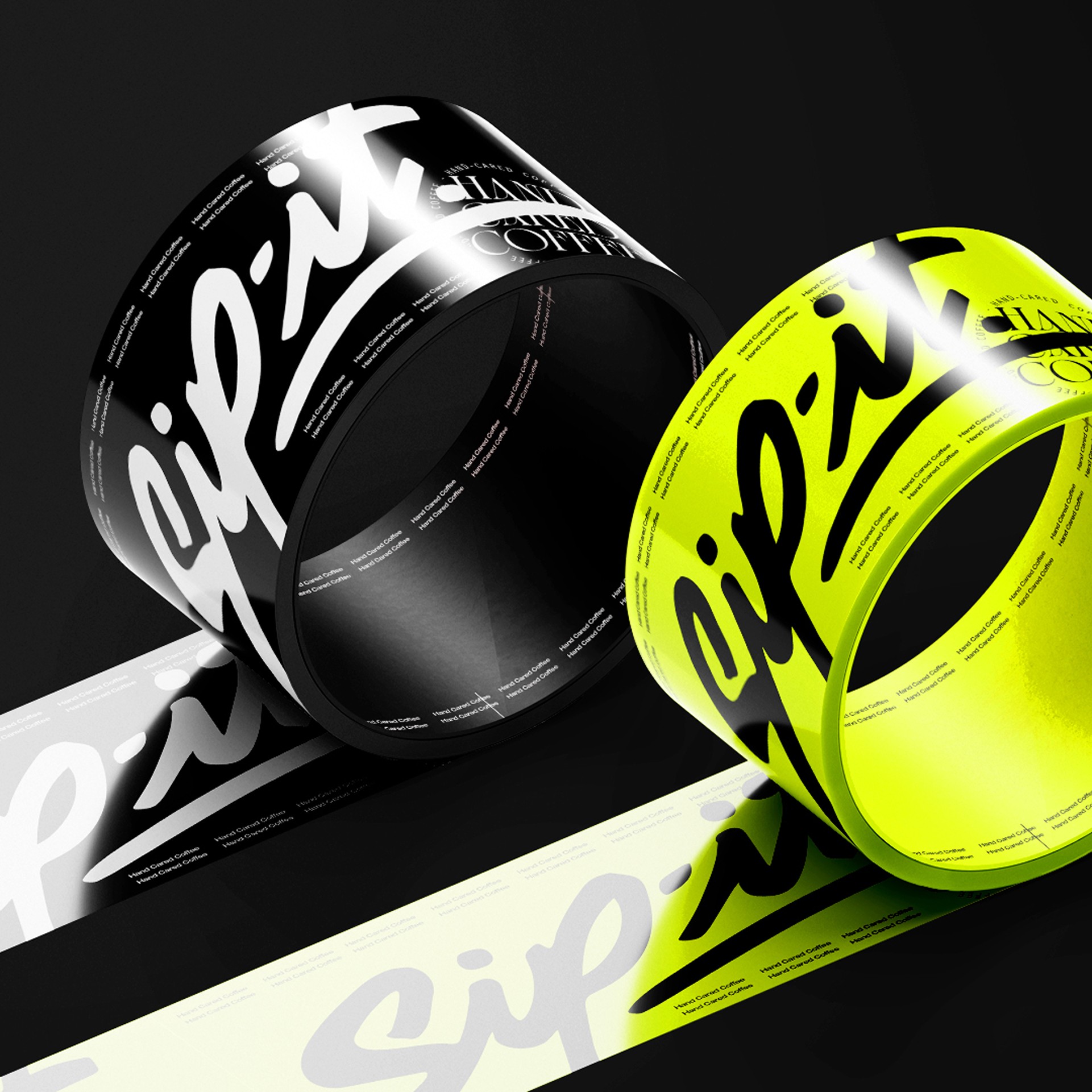

A Brand That Feels as Fresh as Its Coffee
Every visual element was designed to reinforce the brand’s personality. Rather than relying on traditional craft cues, the system embraces spontaneity, confidence, and simplicity, turning every touchpoint into an extension of Sip-it’s bold and approachable character.


Designed to Make Specialty Coffee Feel More Human
Sip-it proves that premium coffee doesn’t have to look conventional to communicate quality. The result is a distinctive identity that connects with younger audiences while giving the brand a memorable voice in an increasingly crowded market.


Explorar proyecto en Behance
Casos recomendados